

Overview
THE PROBLEM
Students find it difficult to connect with other students who are studying similar topics in order to facilitate peer-to-peer learning, support, feedback, and motivation.
THE PROJECT
I wanted to work with something I see myself using. Since I enjoy studying and learning new stuff during my spare time and on my own, sometimes I find it hard to develop a study schedule and find motivation to keep increasing the difficulty level of the subject. So I aim at creating a product that could be used by the persona provided by the project brief, Alex, who is enrolled in a course, and an alternative persona who wants to learn by their own, but struggles with the high amount of information they find on the internet, where there is no clue about where to start.
THE SOLUTION
In my version of Study Together, I’ll focus on organization and connection, where users are able to find and connect with other students who are studying similar topics, share their own studies, relevant material, create and keep track of study timelines and calendars, and explore new subjects to study.
My Role
UI Designer
Context
UI case study for CareerFoundry
Team
Individual
Figma
Tools
Procreate
For those who are curious, here's a sneak peek of the evolution of the home screen wireframes

Low fidelity

Mid fidelity

High fidelity
THE DESIGN PROCESS

User Persona
User Stories
Information Architecture
User Flows
Low-Fidelity Wireframes
Mid-Fidelity Wireframes
Mood Board
UI Elements
UI Style Guide
High-Fidelity Wireframes
High-Fidelity Prototype
Understand & Empathize
USER STORIES
User stories is a great way to understand the user goals while using the product in different steps of the process. The following user stories were based on the project brief provided by the course:
"As a new user, I want to create a profile, so that other students can find me."
"As a new user, I want to find and connect with students studying my subject (or a
related subject), so that we may collaborate."
"As a frequent user, I want to be able to view and share articles, videos, images, and
other files, and write posts for other students to read, so that we can share
knowledge."
USER PERSONA
To better understand my potential users, their motivations, goals and pain points, I created this persona based on the design brief provided by the course. I wanted it to be straightforward and simple so that the team members would understand our user at a glance.

Ideate
INFORMATION ARCHITECTURE
Next step was to start thinking about how the tabs would be organized and what kind of content would be displayed in a certain place, an organization that should be intuitive and straightforward to new and experienced users.
HOME
-
News / Updates from others
-
Post new information
-
Search (buddy, study group, article, etc)
-
Notifications, messages
BUDDIES
-
List of study buddies
-
Suggestions of buddies with similar interests
-
Search for new buddies
-
Follow button
STUDIES
-
My posts history
-
My readings list / TBR
-
To do lists
-
My shared content
-
Academic calendar
PROFILE
-
My course
-
My subject
-
My specialization
-
My interests
USER FLOWS
With the tabs organized and under different categories, I created user flows to visualize how the user will find their information and perform tasks within the app. Since the content in this app is customized and provided by the user, it is important to have a profile creation asks as many information as possible to improve the experience. At the same time, the user will always have the option to skip this process and come back later if necessary.
As a new user, I want to create a profile, so that other students can find me.

As a new user, I want to find and connect with students studying my subject (or a
related subject), so that we may collaborate.

As a frequent user, I want to be able to view and share articles, videos, images, and
other files, and write posts for other students to read, so that we can share
knowledge.

Design
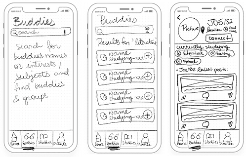
LOW-FIDELITY WIREFRAMES
My main inspiration comes from social media websites, so that the users will be familiar with the main functionalities and layout.

PROFILE CREATION
-
Besides the preset categories, users can search their answers
-
Buddies suggestions based on information entered during profile creation

-
Timiline similar to facebook, where the user get updates about buddie’s activities
-
Users are able to upload pictures, PDFs, links, and other files to their timeline, and add a comment to their file
-
Users are able to write down in the app or paste texts written in other apps as well
HOME / POST
-
Users can search and find study buddies and groups according to similar interests
-
Each buddy or group will be displayed as a card where it shows their study topic
BUDDIES
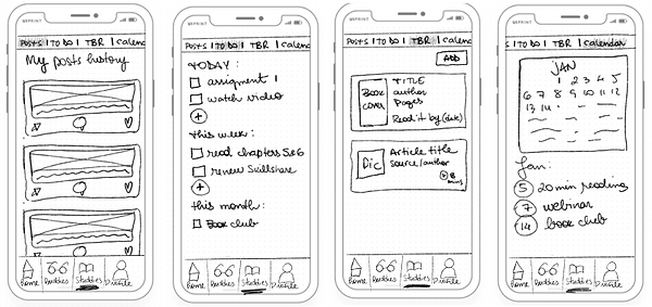
STUDIES
-
"Posts" shows all activity related to the user’s studies previously shared on their timeline
-
Under “ To Do”, the user can organize his studies and check off tasks to keep motivation high, and studies organized
-
The TBR is a place to store and keep track of readings, either books, articles, links, etc. The user can manually add or add from buddies’ posts on the timeline
-
Another organizational tool, “Calendar” will be great to create a studies timeline and keep track of events that might add to the educational experience
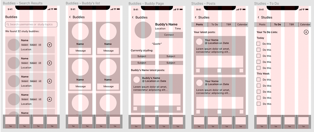
MID-FIDELITY WIREFRAMES
To create the mid-fid wireframes, I implemented the 8pt grid rule for the elements because I wanted to make the creation of a responsive website an easier and smooth process, where I can use multiples of eight for larger interfaces. Grids and Gestalt principles helped me to aligned all elements in an organized manner. For accessibility, I added a label to the icons, and explanations of what it is expected from the user in a certain stage of the process.


MOOD BOARD
According to the project brief, Study Together has to convey a ”friendly, welcoming, and reasuring" atmosphere, and the main colour should be green. I went for a bold, vibrant, and popular color scheme, Adding some gradients and reducing the opacity level of that colour scheme allow me explore more options for the UI elements, and keeping the solid and bold colours helps me to the address accessibility issues that might arise.

UI ELEMENTS & STYLE GUIDE
After experimenting different combinations with the chosen colours, and creating the high-fidelity wireframes, I developed the style guide so that the developers have a reference document whenever they need for information such as colours, typography, elements dimensions, etc.
LOGO

Tablet Logotype

Desktop Logotype

App Store Logo
COLORS
BRAND COLORS
STATE COLORS

TYPOGRAPHY

ICONOGRAPHY
-
Icons are within 24x24pt frames
-
Clickable icons are purple (#8600D9), just like buttons
-
Icons that convey only a message are in dark blue (#34495E)

UI ELEMENTS


Please check the complete Style Guide by clicking here.
Prototype
HIGH-FIDELITY WIREFRAMES & PROTOTYPE
Creating the hi-fid wireframes was a fun experience, and I loved testing the colours and gradients in different places. The animations during the onboarding and loading pages were interesting as well, and I was able to experiment different animated interactions during the process.

Be my guest and get your own StudyBuddy experience by clicking on the prototype below:
DESIGNING FOR DIFFERENT BREAKPOINTS
As a responsive app, StudyBuddy can be access in different breakpoints, which gave me more opportunities to explore different elements in a given screen. Users can write their comments to peer review their buddies' posts on desktop, read an article on tablet, and take a look at their next step on their studies on their phones. StuddyBuddy will always be there, everywhere, for their success!


Reflections
NEXT STEPS

Conduct user tests to
validate visual decisions

Develop further screens for desktop and tablet

Send the prototype to a developer to get their feedback
LESSONS LEARNED
Visual Design has a huge impact in the user experience. This one I already knew, but the UI approach to a project gave me a new and fresh perspective. It was fun to deepen my knowledge and learn new things related to interface design.
Animations are awesome! Creating animations for the interactions was super fun, and experimenting different types was a great way to learn more about what Figma is capable of doing.
Organization makes our lives easier. Applying naming conventions to the elements and screens as soon as you create them helps to keep everything organized not only for me, but for every other team member, improving the experience of the whole team, including myself (isn't improving experiences our main goal?)
Use your mood board as your guide, always. Sometimes, it's overwhelming to stare at a mid-fid prototype and get lost about which colours to use. The mood board was created for moments like this, and sticking to it provides the right mood to get you inspired.